
Home Page
The Home Page (the “showcase”) is the front page of the store. It is not a fixed page. You build it from rows (banners) that you can add, move and change: images, sliders, YouTube videos, texts and products of a category. The article has two parts:
- Front End: how the home page looks to the visitor.
- Back End: how you set it up from the Home Page menu.
AI tools: in the text of each row there is a Translate button, which uses AI to translate the Greek text into the language you choose and adds it as a second language. They work when the connection to ChatGPT or Claude is active in the Platform Settings.
Front End: the home page of the store
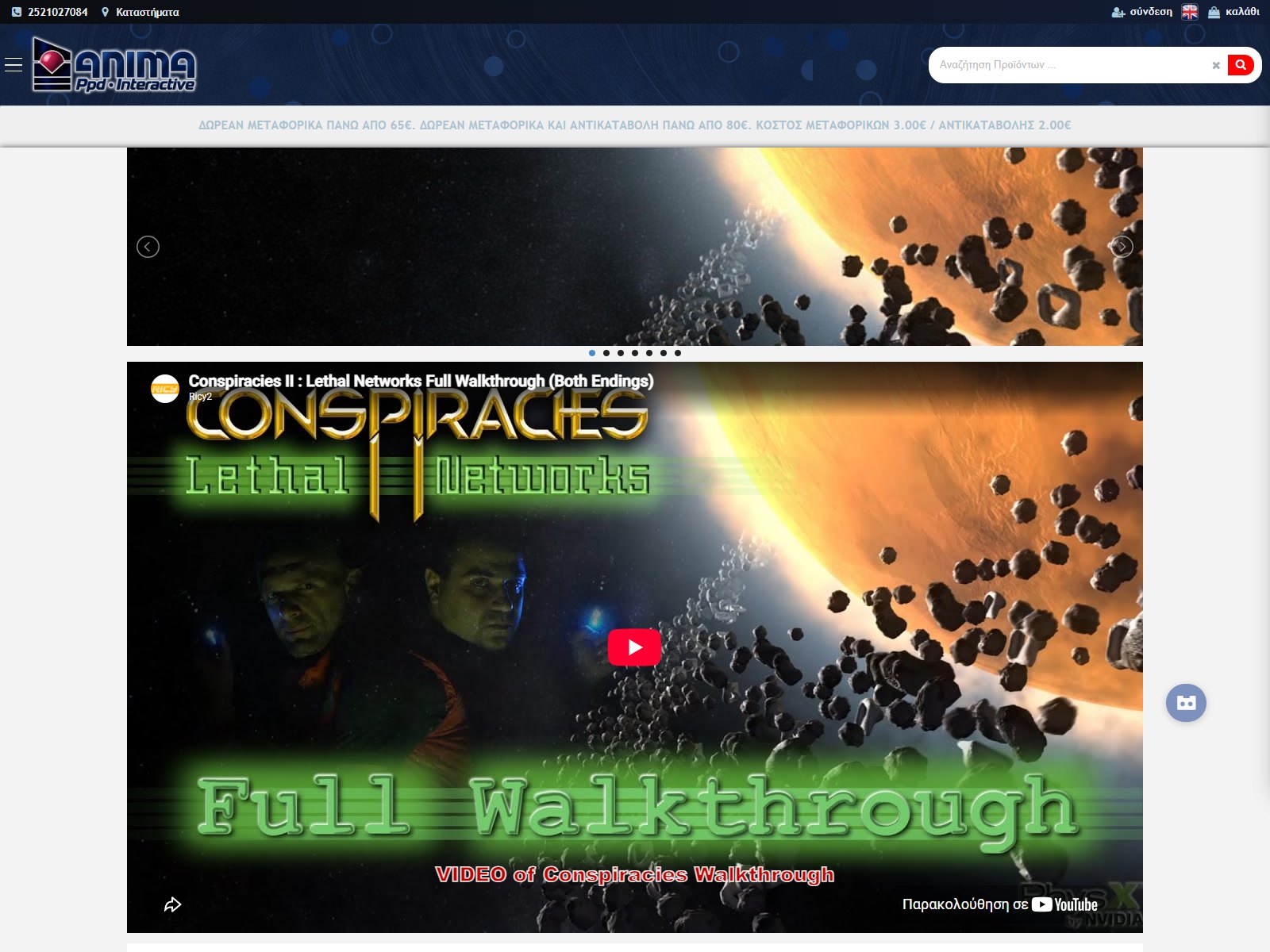
The visitor sees the rows in the order you have set, one below the other:
- Slider: images that change with arrows and dots. It is made from several rows that have the same “association name” (here 7 images).
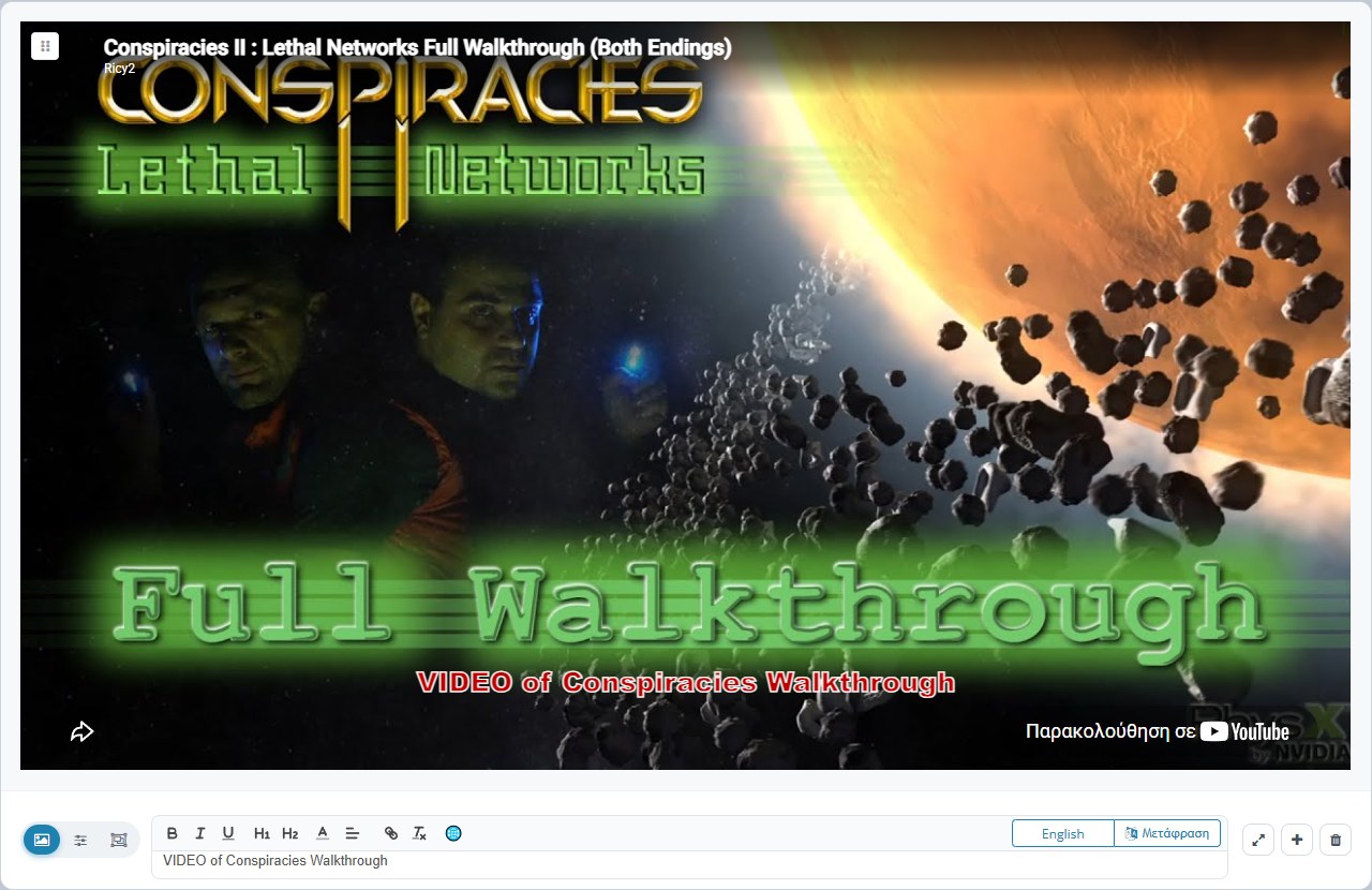
- YouTube video: an embedded video. It loads only if the visitor has accepted the cookies, otherwise a box with an accept button appears.
- Text: a row that has only text, with or without a link (it can be a title, a paragraph or a centred message).
- Image (banner): an image that leads to a product category or to some page. One, two, three or four fit side by side across the screen width, depending on the size you chose.
- Products: a grid of products of a category, with price, discount and a quick-buy icon.
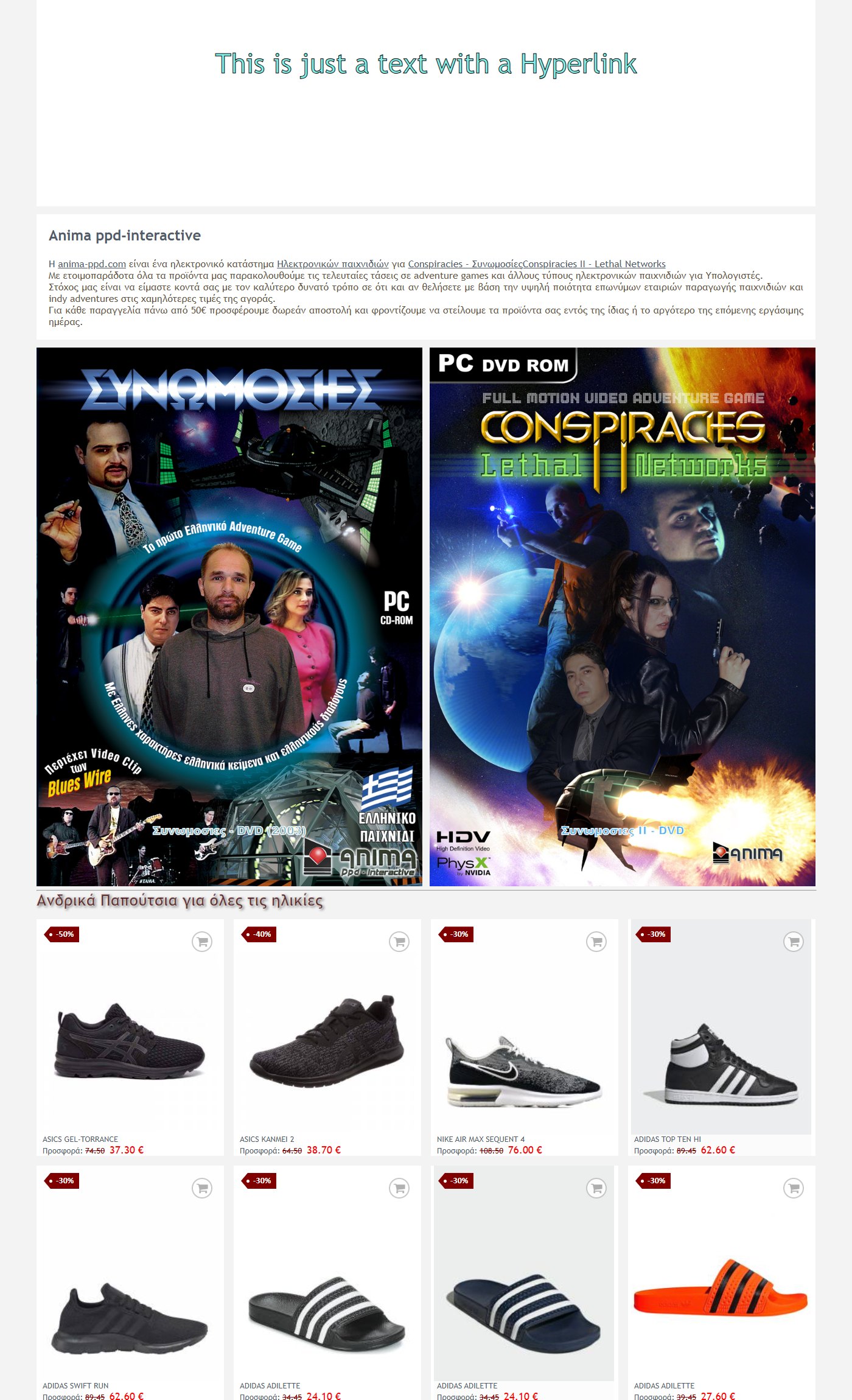
The texts are displayed in the visitor’s language (Greek or English). If a text has no English version, the Greek one is displayed.
Back End: setting up the home page
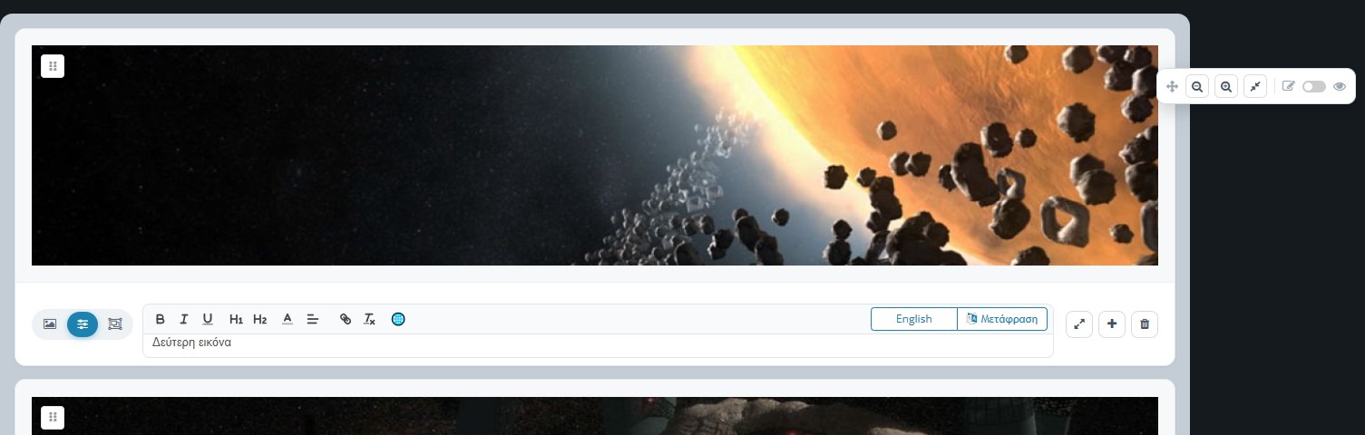
The page shows all the rows of the home page in their order (at the top it says how many there are, e.g. “13 results”). Each row is a card: at the top the preview as it will appear in the store and below its title and its tools.
The three row types
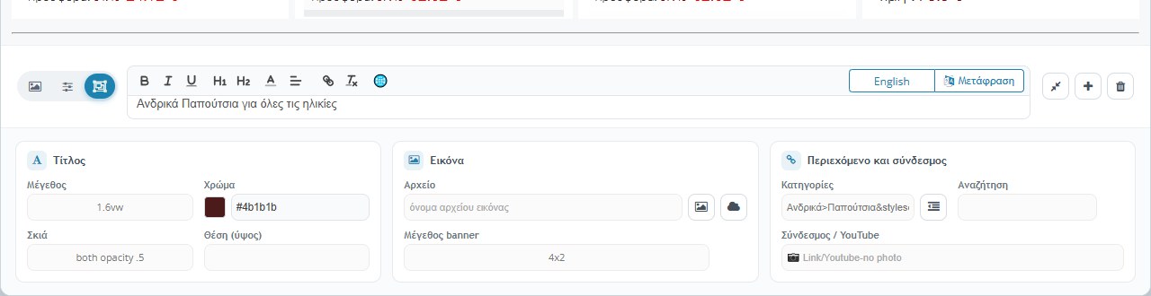
The three round icons at the bottom left of the preview choose what the row will show. The selected one is blue:
- Single image: an image with a title, a YouTube video or just text.
- Slider: the image becomes part of a slider. Next to it a field appears with the association name. All rows with the same name are joined into one slider, and the slider appears in the place of the first one.
- Products: the row shows a grid of products.
The details of a row
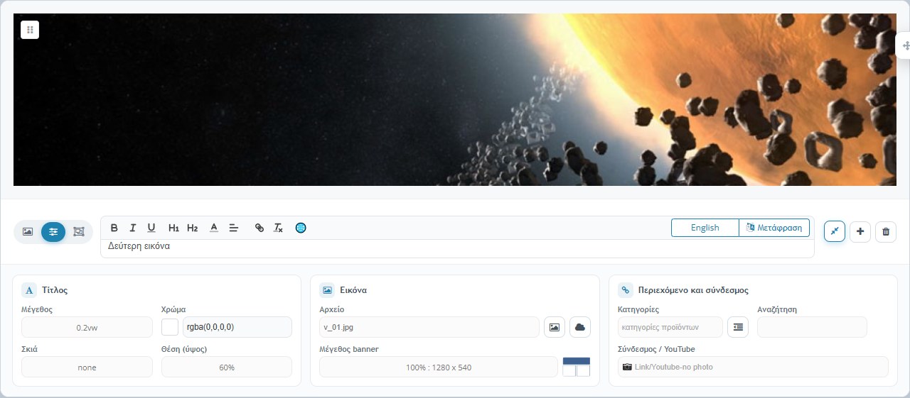
The More / less button (arrows, on the right) opens and closes the details of the row. The settings are in three groups:
- Title: letter Size (in vw, i.e. proportional to the screen width), Colour (with a picker), Shadow (from “none” to outline and shadow, with transparent and negative versions) and the Position (height) of the title over the image, as a percentage from 10% to 90%.
- Image: the image file and the banner size. You upload the file with the image button or choose it from those you have already uploaded with the cloud button (“Show platform images”).
- Content and link: the Categories (the button next to it opens the category panel), the Search and the Link / YouTube field.
The banner size
The size defines how much width the row takes and therefore how many fit side by side:
- 1280 px (e.g. 1280 x 540, 1280 x 350, 1280 x 250): the full width.
- 900 px (e.g. 900 x 450, 900 x 506 16/9): about ¾ of the width.
- 800 px (800 x 800, 800 x 450 16/9): half the width, two side by side.
- 600 px (600 x 600, 600 x 338 16/9): one third, three side by side.
- 400 px (400 x 400, 400 x 225 16/9): one quarter, four side by side.
The options with “?” (e.g. 1280 x ?) follow the height of the image. For product rows the size is written as columns x rows (e.g. 4×2 means 4 columns and 2 rows, i.e. 8 products).
What a click does: category, search, link, video
- Categories and Search: in an image row, the click opens the product list of the category you chose, with the search you typed. In a product row, the same options define which products will appear (e.g. category “Men>Shoes” and a word in the search for filtering).
- Link / YouTube: if you write a full address (containing “http”), the click opens that page in a new tab. If you write only the code of a YouTube video (e.g. “GOlR2LN0PHw”), the row becomes an embedded video.
The title (row text)
Each row has a text field with an editor: bold, italic, underline, H1 / H2 headings, colour, alignment, link and clearing of formatting. The text is displayed over the image, or alone when there is no image.
- Languages: the first part is Greek. The globe icon (🌐) inserts a separator, so that you can then write the English version. The store shows the version that matches the visitor’s language.
- Translation (AI): the “Translate” button translates the Greek text into the language you chose (e.g. English) and adds it as a second language. Check the result before you save it.
Adding, deleting and moving rows
- + (Add): puts a new row right below this one.
- Bin: deletes the row (from the home page, once you save).
- Moving: you grab the row by the handle (the square with dots at the top left of the image) and drag it up or down.
The floating tools window
On the right of the screen there is a small window that follows the scroll:
- Move: you drag it wherever suits you.
- Zoom out / zoom in: shrinks or enlarges the whole page in 10 steps (from 30% to 100%), so you can see many rows together.
- More / less: opens or closes the details of all rows.
- Design ↔ Preview: the switch shows the home page as it will appear in the store, without the tools.
Saving
The changes are not applied until you press Save (bottom right, next to Cancel). Saving writes all the rows in their current order and the store’s home page is updated immediately.
What to watch out for: the home page images are uploaded to the “Files/HomePage” folder and can be large. Prefer images suitable for the banner size you chose, so that the home page loads quickly. If you delete a row that was a link to a campaign, check that no link to it remains elsewhere.